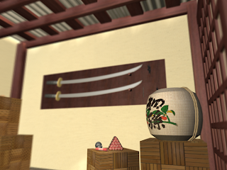
Ninja Ammo Room
Friday, September 30, 2011
Friday, September 23, 2011
Thursday, September 15, 2011
Logo
Katherine Anne Porter School in Wimberley is a small, accredited public charter school founded by former board members of the Katherine Anne Porter Museum. Their school mascot is a dragon and their colors are silver, blue, and black. Their dragon logo they use is about 10 years old, so I've come up with some refreshed logo options.
My first step was to create a plane and apply my quick sketch to it as a diffuse bmp texture in material editor. I then used the line creator to trace over the drawing. I separated the legs, arms, head, and split the wing into 4 pieces. I beveled them to give them some height and then treated it like a paper sculpture. The chest rivets are an arch with a squeeze modifier. The scales are circles and the neck fringe is just lines made visible in the render as rectangular. I had some trouble getting things to turn in the right direction, so I had to make the wings upright and then turn them in the x plane. Because I was going for more of a paper sculpture/cut out kind of look, I did not use the mesh smooth modifier. Ideally, I would like to, instead of the repeated dragon, include 4 icons that would symbolize the school on the shield.
Below are a couple of other views.
Because logos are typically more simple and meant to be easy to recognize, I created these as well for watermarks and such:
The dragon in the middle was made with the exact same drawing as the coat of arms. I used the trim tool to make it one solid shape and modified the wing before beveling and using the mesh smooth. The text on the top was really difficult. I thought I'd be able to just bend it, but the bend did not go in the direction I expected. So, I did some research and made another circle path within the circle and attached the text to it with the path distort modifier before beveling it. The wax is a silverish material, but made slightly transparent and with some marble and noise mapping.
Thursday, September 8, 2011
1920's Steam Punk Accountant Robot
Robot renders are posted here with various angles. I had some fun experimenting with all the different modifiers and shapes. I also tried some things with the materials editor.
He is made up of mostly boxes for a sense of reliability. I started with a simple sketch and continued to have more ideas as I worked on him. The ear trumpets and the flue were made with tubes modified by the squeeze modifier. Other twisting pipes were made with bending and pieced together. Smaller tubes' edges were rounded with the softener and then used as embellishments.
Printing Stock Market report the old fashioned way. Self defense or office organizer? . . . or maybe just litter control.
Burrows Calculator on the right. Bicycle wheels seemed more fun then treads or train wheels. I looked at really early computers to design the mid section.
The lever's side embellishments were long boxes later twisted. After placing one, I just copied the others using the turn gizmo. I also had fun with the FFD 4x4x4 modifier to make handles and the light bulb. Nuts and bolts were small cylinders with lessened segments, turned, then copied. The computer wires were just skinny, long cylinders, but I had some trouble bending them the way I would like so I pieced about 4 cylinders together, bent them in different directions and then copied them over to each plug. For the scrolling stock market details, I found the text in the splines menu. To make them solid, I beveled them. The paper coming from his mouth, the Burroughs Adding Machine, and paper speared on the skewer were modified with wave, although, I get the sense that there is a better way to do this. I referenced images of steam punk style piping, photos of old light bulbs, antique bicycles, steam engines and early computers to get the details.
The light bulb was made with a sphere, stretched on the bottom. The filament is a combination of a sideways spring and 2 copies of the dial needle in opposite directions.
I worked out how to get the glass from this site, but had to leave off the raycaster. :-(
For the gold on the bicycle wheels and such, I followed this how-to. For everything else, such as wood and brass, I kind of guessed.
If you're interested. Here's a copy of what my concept sketches looks like as well.
Friday, September 2, 2011
Hello,
My name is Aja. A lot of people ask me if it is my given name, and it is. It came from a Steely Dan album, although I think that originally it was an Indian name meaning "goat" according to the internet. :-)
My background is primarily in photography, but I have experimented with a number of other mediums as well. My first big serious project was painting a 360 degree mural in my high school World History teacher's classroom which included scenes from Africa, Stone Henge, the Colosseum, and the Superintendent's home, Malta.
I started selling my own wire wrap jewelry to schoolmates when I was 17, eventually branching out to sell at art fairs and festivals. The project eventually evolved into a strictly photography business where I produced nature and abstract photography, but also a great deal of portrait and weddings services. I have learned from photography the value of light and shape in all manor of visual arts. I have experimented quite a bit with found art sculpture as well, mostly using wine corks pieced together to create various creatures such as dragons and lizards covered with delicately placed sequins for scales. The one at the right was my favorite. She's made out of a whole lot of wine corks, a couple of chopsticks, and individually glued sequins as skin. And no, I did not drink all of the wine to supply the corks . . . they were donated.
I am always trying to improve my work and style and am highly inspired by filmmakers such as Terry Gilliam, Akira Kurosawa, and Wes Anderson, just to name a few. The care and detail put into the settings and characters excites my imagination. Some favorite photographers include Moose Peterson and Joe McNally. I also love artists such as Ralph Steadman, Hieronymus Bosch, Salvador Dali, HR Geiger, and even Frank Miller.
My work life has included a number of roles in the hospitality industry, including an opportunity as a marketing assistant where I had some training under the graphic designer and was responsible for creating flyers and signs.
With 3d animation I hope to combine my fascination with cinematography, sculpture, and storytelling to make fun environments and characters. Due to a love for interactive media, my biggest interest is in game art, but I am open to other paths such as the film industry as an animator or even architecture.
Subscribe to:
Posts (Atom)